Bad Visualization 2: A terrible pie chart
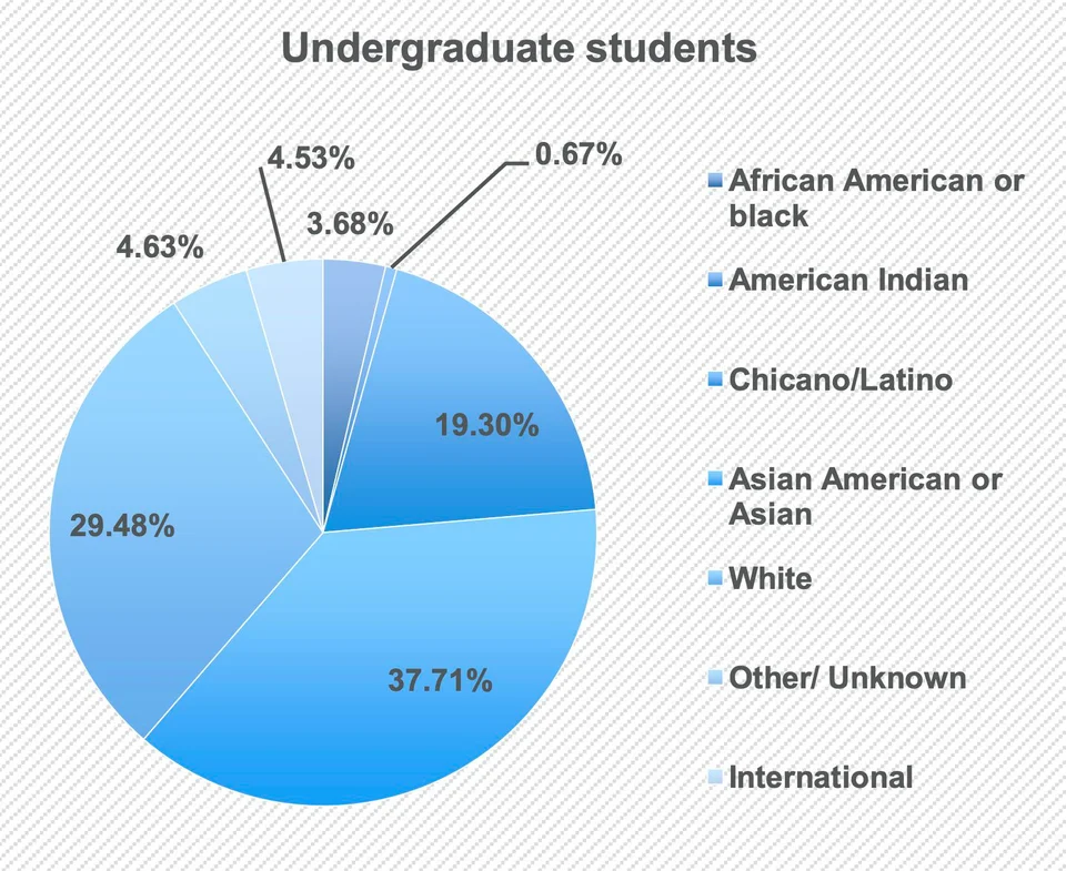
Basics of current visualization
- Target Audience: Administrators of a university (I’m making a big assumption here, but need it to evaluate this properly)
- Exploration or explanation: Exploration
- Purpose: Highlight the racial distribution of the undergraduate population
- Story: None (exploration)
- Idiom: Pie chart
- Data scale of proportion: Ratio
- Data scale of race: Nominal
Issues
Bad Idiom Choice
The relative differences between some of the wedges (e.g. 4.53% vs 4.63%) are difficult to visually ascertain with a bar chart because the angles are similar
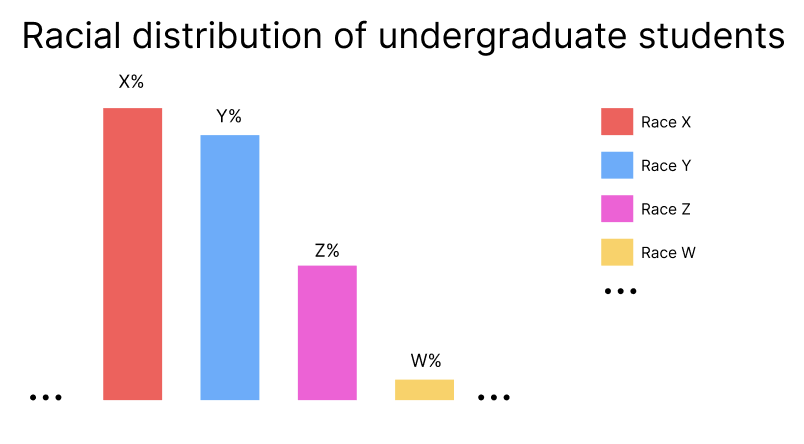
Suggestion: Use a bar chart instead with labels of each exact percentage. The height levels are easier to visually inspect
Bad channel for wedge color
Currently uses various shades of graded blue (saturation, a magnitude channel) for nominal data (which should use an identity channel)
Suggestion: Use hue (a categorical color scale) instead of saturation.
Bad color scale for wedge color
The gradient makes interpreting the legend difficult.
Suggestion: Use a solid color
Wrong data
“International” is a relative description of country of origin, and not a race
Suggested Viz Mockup