Bad Visualization 1: A small exploration on the fragility of badness
Goodness/Badness of Visualization Depends on Interpretation
In particular, it’s fragile to the interpretation of the following:
- Who is the target audience?
- What is purpose? E.g. if it’s explanation, what’s the story?
Perspective 1: Without a sense of humor, this is a terrible visualization
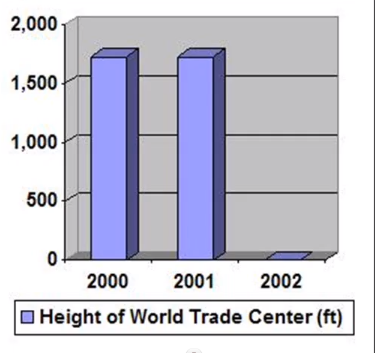
Basics of current visualization
- Target Audience: People interested in the height of the WTC over time
- Exploration or explanation: Explanation
- Purpose: Inform people of the sudden drop in height after 2001
- Story: Height is stable at ~1750ft until 2001, after which it is 0
- Idiom: 3D bar chart
- Data scale: Ratio
Issues
Wrong abstraction
- Story is about presence of height, not particular value of height
- Suggestion: re-encode the magnitude channel of the bar chart into an identity channel (has height vs doesn’t have height)
Wrong data scale
- Should be ordinal (only 2 distinct values ordered by magnitude), or even nominal (a binary encoding to highlight)
Bad idiom choice
- 3rd spatial dimension encodes no additional information
- Bar chart values are needlessly imprecise
- A lot of ink to show very little information (not the same as a low data-to-ink ratio. This is more like information-to-ink ratio and is an encoding problem)
Insufficient data to establish trend
- Suggestion: add 20 years of height data before and after
Data is inaccurate
- Height of WTC is 13
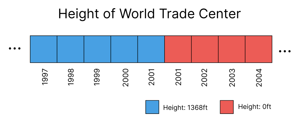
Suggested Viz Mockup
Perspective 2: With a sense of humor, this is very good
Basics of current visualization
- Target Audience: People who enjoy dark humor
- Exploration or explanation: Explanation
- Purpose: Make audience laugh
- Story: The planes that destroyed the twin towers changed their height to 0ft
- Idiom: 3D bar chart
- Data scale: Ratio
Nice touches
- Great idiom choice: 3D barchart allowed a symbolic representation of the two towers (using the bar volumes of the first two datapoints)
- Note: Data scale needs to be ratio for this joke to work, so that the bar chart symbol of the towers can be constructed out of the magnitude channel
- The indirect encoding of the data of the planes crashing makes the joke funnier, as the audience comes to the realization of what is truly represented on their own
- Would be less funny if the audience hadn’t gone through the emotional journey of confusion (Why did the height suddenly drop? Oh 9/11 LOL) and were just told the takeaway directly (no 9/11 until 2001)